Capital and its Cost – a primer for SA shareholders, their managers and regulators

Capitalism is a very good description of our economic system. The modern economy revolves about the competence with which firms use capital entrusted to them. Successful, profitable firms, consistently invest in projects that return more than the cost of the capital they employ. They are strongly encouraged to expand. That is to make more of the economy’s scarce resources – people, natural resources and capital. Firms unable to cover these costs of capital are as strongly encouraged to waste less, that is to yield scarce resources to those firms that are able to put them to better use.

Read the Full Version here or the Short Version here.

Real exchange rates: All about capital flows

Explaining the rand – don’t look to Purchasing Power Parity (PPP), but to capital flows to explain the value of the rand

When exchange rates conform to Purchasing Power Parity (PPP), that is the exchange rate moves to compensate for differences in inflation between two trading countries, the exchange will not have any real effects on the economy. Given PPP, what is lost, say, for an exporter or gained by an importer in the form of faster or slower inflation, is fully offset by what is gained or lost by compensating movements in the exchange rate. This would leave importers or exporters no more or less competitive in their home or offshore markets. PPP exchange rates are however at best a very long run equilibrium rate to which exchange rates may trend but seldom conform.

The SA experience with exchange rates is one where large deviations from PPP exchange rates are the rule rather than the exception. The starting point for any calculation of PPP equivalent exchange rates is of crucial importance. The date should be be one when the exchange rate appears very close to its long term PPP value.

This was the case for the rand/US dollar in 1995. Before 1995 the value of the commercial rand (this was used to pay for imports, dividends and interest and dividend payments abroad and received for exports) was protected by exchange controls on both foreign and domestic investors. Flows of capital to and from SA were conducted through the transfer of a more or less fixed pool of so called financial rands. These financial rand movements, usually expressed as a discount to the commercial rand, left the value of the commercial rand largely unaffected by capital flows and insulated against changes in investor sentiment. Hence foreign trade driven commercial rand exchange rates stayed very close to their PPP values, as was the case in 1995.

The capital controls applied to foreign investors in the form of the financial rand were abandoned in 1995. Ever since then, flows of foreign capital to or from SA – driven by levels of SA or global risk tolerance – came to influence the value of the unified rand. The rand became less a trading and more a capital driven currency in the short run.

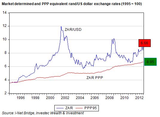
We show below (starting our calculation of the PPP equivalent rand/US dollar exchange in 1995) that the rand had become deeply undervalued by 2000. If PPP had held between 1995 and 2013, the US dollar that cost R3.35 in January 1995 would have cost a mere R6.66 in January 2013, leaving the rand about 28% undervalued compared to its PPP value.

If we start the same calculation in January 2000, when the US dollar fetched R6.31 and had PPP equivalent exchange rates been maintained, the US dollar would now cost R9.68, making the rand appear 10.5% overvalued. However, as we have shown, the PPP equivalent value of the rand in January 2000, using January 1995 as the starting point, was as little as R4.36, not the R6.31 it cost. The rand, as a result of freed up capital movements after 1995, was already deeply undervalued by 2000. It was to become much more deeply undervalued in 2001, but thereafter began to recover with improved investor sentiment.

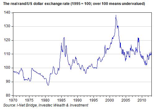
In the figure below we show the real rand/US dollar exchange rate, that is the deviation in the value of the rand from PPP, taking 1995 as the starting point. The real commercial (then unified) rand has fluctuated wildly over the years. It was slightly overvalued during the gold boom seventies. It weakened significantly when SA failed to cross its political Rubicon in 1986. The largest burst of weakness came in 2001 for SA specific reasons – largely related to the panic demands for asset swaps when they first became available – and the real rand lost as much as 40% of its value. Thereafter it began a more or less consistent recovery, helped by large foreign flows into the JSE (though it was interrupted by the Global Financial Crisis in 2008 that weakened all riskier emerging market currencies). The strength of the rand and the JSE after 2003 was not at all coincidental. The recent weakness of the rand, very much SA specific, has moved the real rand from near parity with the US dollar to about 10% undervalued.

Clearly it is investor sentiment that has come to drive movements in the exchange value of the rand. Sometimes these perceptions are SA specific and at other times much more generally explained by global attitudes to risk taking.

The reality for SA exporters and importers post 1995 is that they have had to cope with a highly variable real exchange rate. It is instructive to note that the extreme moves between 1983 and 1986 can also be explained by capital flows: the financial rand was temporarily abolished in 1983 and then reinstated in 1986.

It is these exchange rate fluctuations that greatly complicate the business of importing and exporting. Ideally, given consistency of economic policies, the real exchange rate would stabilise. Unfortunately fiscal and monetary policy in SA has been far more consistent than expectations of them. It is these expectations of policy that drive capital flows more than the policies themselves. Until SA can convince investors of the permanence of investor friendly policies, such real exchange rate volatility will continue.

The advice for SA policy makers is to maintain investor friendly policies, including the freedom to move capital in and out of the SA economy. The depth of the SA capital markets and the consequent liquidity it offers has been a major attraction for foreign investors, upon which the SA economy remains highly dependent for its growth, given the lack of domestic savings. The economy will have to trade off exchange rate instability against easy access to foreign capital.

Resorting to capital controls would drive capital away over any long term view. Moreover improved labour relations would be highly investor friendly. It would lead to a stronger real rand and a sronger economy supported by larger capital inflows. Brian Kantor

Equity markets: Drawing the investment lessons of the past year and the past decade

Investors on the JSE enjoyed outstandingly good returns in 2012 of about 26%, and have also done well over the past decade. We examine the factors behind this performance and what could wait in store in 2013.

Another outstanding year on the JSE

Investors on the JSE enjoyed outstandingly good returns in 2012 of about 26%. These returns concluded a decade of outstanding performance. Average returns on the JSE over the past 10 years have more than compensated for equity risks, as we show below. An extra four or five per cent a year from equities would have been good enough. The JSE provided much more than this.

A wonderful decade for investors on the JSE and other emerging markets

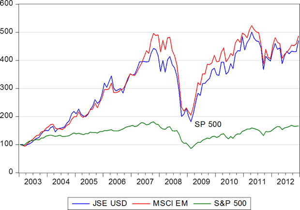
Over the past 10 years (1 January 2003- 31 December 2012) annual returns on the JSE (calculated each month) averaged 18.4% p.a. The SA All Bond Index (ALBI) returned an average 9.2% p.a and the money market, represented by the three month interbank lending rate (JIBAR) returned an average 7.87% p. a. before any fees. Since inflation averaged 5.5% over the same period, real returns from all the asset classes were satisfactory but not nearly as good as those provided by the equity market.

These returns were also excellent when translated into US dollars. In US dollar terms the JSE returned 16.4% p.a on average over the last 10 years, very much in line with the equally outstanding returns realised by the average emerging market – represented by the MSCI EM Index – that provided average returns in US dollars of 16.5% p.a. over the 10 year period.  The S&P 500 Index realised only 5.8% p.a on average over the same period.  It should  be appreciated that the 10 years includes the very severe impact on share markets of the Global Financial Crisis of 2008- 09; when at its worst in February 2009, the JSE was 49% lower than a year before and 80% lower in US dollars. That same month the S&P 500 was 59% down on February 2008, while the EM Index was 87% lower.

Total returns: US$100 invested on 1 January 2003, with dividends reinvested (2003=2012)
Source: I-Net Bridge, Investec Wealth & Investment

The winner was JSE Industrials, not Resources

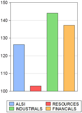
Investors on the JSE in 2012 would have done especially well had they concentrated their portfolios on Industrial rather than Resource companies. The JSE Industrial Index returned over 44% in 2012 while the Resource Index provided a total return of less than 3%. (See below)

JSE total returns in 2012

Source: I-Net Bridge, Investec Wealth & Investment

The game changer on the JSE: Industrials or Resources?

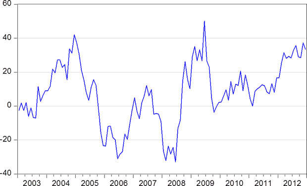
Such outperformance by JSE Industrials over Resources is by no means an unusual event. It should be clear that for active fund managers anticipating these differences in returns is the key to beating the market as a whole, so adding value for their clients after fees.

Difference in annual returns: JSE Industrials vs JSE Resources (2003- 2012)

Source: I-Net Bridge, Investec Wealth & Investment

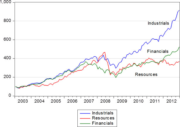
JSE Industrials have provided far superior returns than the average Resource company (for significantly less risk) over the past 10 years. As we show below, R100 invested in the Industrial Index on 1 January 2003, with dividends reinvested, would have accumulated an impressive value of over R900 by the end of 2012. The same R100 invested in the Resources Index would have yielded less than R400.

Cumulative returns on the JSE: Industrials vs Financials vs Resources. Value of R100 invested on 1 January 2003

Source: I-Net Bridge, Investec Wealth & Investment

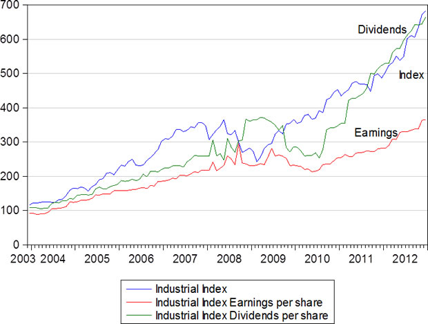
The outstanding performance of the JSE Industrial Index (a market capitalisation weighted index) is fully explained by the economic performance of the companies included in the index. Rising share values have been lifted by a rising tide of reported earnings and dividends. Both the value of the Industrial Index and the dividends distributed have increased by 7 times since 2003. The payout ratio of earnings to dividends has declined from 3.2 times dividends in 2003 to 2.1 times in December 2012.  

If the past were to be the guide to future action it can be expected that the weight given to Resources in the representative SA portfolio will decline and that given to Industrials will increase. That Resources have a large weight on the JSE All Share Index does not justify anything like the same weight in SA portfolios on a risk adjusted basis. We should expect SA investors to reduce their exposure to resource companies to something like the international norm – which would be about a 10% weighting.

The JSE Industrial Index, dividends and earnings per share (January 2003=100)
Source: I-Net Bridge, Investec Wealth & Investment

Not all Industrial companies on the JSE are alike in their exposure to the SA and global economies

The Industrial Index of the JSE however combines companies with very different exposures to the SA and global economies. Dominating the Index by market value are companies that we describe as Industrial Hedges. These are companies that are heavily dependent for their sales, costs and profits on the global economy rather than the SA economy. Richemont (CFR) is a very good example. Its luxury goods are all produced outside SA and very few of them are sold in SA. SABMiller (SAB) is a global rather than a SA brewer. Aspen (APN) in pharmaceuticals, MTN in mobile networks and Naspers (NPN) in internet, have joined the ranks of the companies with much more at stake outside rather than inside the SA economy. British American Tobacco (BTI), now the largest company listed on the JSE, is another large Industrial Hedge, ie little affected by SA interest rates or the state of the SA economy. Their rand values furthermore will tend to go up and down in line with movements in the exchange value of the rand.

These Industrial Hedges are to be usefully contrasted with the SA economy plays – the retailers, banks, property and logistics companies listed on the JSE whose top and bottom lines react to the SA economy. Their share market performance is SA interest rate sensitive and a strong rand, low inflation and low interest rates are very helpful to their sales volumes and operating margins. A weak rand and the higher inflation and interest rates that may follow a weaker rand will damage their ability to earn profits and grow dividends.

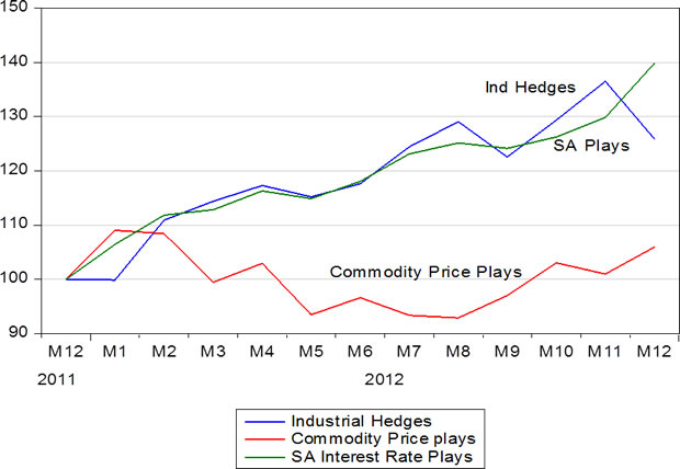
In 2012 these two categories of large industrial companies performed very similarly on both the earnings and valuation fronts as we demonstrate in the chart below. We have created Indexes for these different groups of JSE companies, have measured Index earnings per share and have compared them to each other and to the Resource Companies  (excluding the gold mining stocks), which we call commodity price plays. As may be seen the Industrials gained ground on the commodity price plays in 2012 on the basis of much stronger and more consistent growth in earnings and (not shown here) in dividends.

Industrial Hedges vs SA Plays vs Commodity Price Plays; total returns (1 January 2012 – 31 December 2012)

Source: I-Net Bridge, Investec Securities, Investec Wealth & Investment

Index earnings per share: Industrial hedges vs SA Plays vs Commodity Price Plays (1 January 2012=100)


Source: I-Net Bridge, Investec Securities, Investec Wealth & Investment

The surprisingly good performance of the SA plays in 2012

The surprising feature of 2012 is that while the Resources companies felt the cold draft of a weaker global economy and lower commodity prices, the Industrials continued to grow their earnings despite slow growth. Furthermore the economic performance of the SA economy plays was compromised by the weaker rand that put pressure on imported input costs and pricing power. Yet the SA plays were greatly assisted by low and stable interest rates. The weaker rand and the higher rate of inflation did not lead to higher interest rates, as might have been expected. The SA Reserve Bank in its interest rate settings and commentary helpfully (and correctly in our view) adopted a dual mandate – a concern for growth as well as inflation. It can be expected to continue to influence the economy in this way.

There was no demand side pressure on prices, as the Bank pointed out, and given the weak global economy and the impact this was having on export prices and volumes – harmed additionally by strike action in SA – domestic demand needed encouragement in the form of lower interest rates (and received it). Longer term interest rates also moved lower –despite more inflation – helped by a global search for yield that was found in the SA bond market.

Explaining the performance of the rand in 2012 and beyond

The weaker rand since year end will have been helpful to the value of the Industrial Hedges and perhaps more helpful to the commodity price plays – provided they can maintain or increase output in the face of Industrial action. A weaker rand is not helpful to the SA economy plays. Yet the danger posed to these companies and the service sector of the SA economy in the form of higher interest rates still seems highly remote.

The rand has demonstrated much SA specific weakness linked to the Industrial action and the threat poor labour relations poses to the SA economy and its growth prospects. The rand is about 15% weaker than it would have been if, as before, emerging market risks and market developments had continued to dominate its exchange value. Such forces, including the appetite for emerging market equities and bonds, will continue to influence the rand from day to day and month to month. But strength in the rand will depend also on perceptions of SA economic policy strengths and weaknesses. Any sense that the SA government is making progress on the labour relations front (not an entirely unrealistic proposition) will be helpful to the rand at its current much weaker levels. 

Rotation by SA Fund Managers between Industrials and Resources will not matter very much to the outcomes on the JSE

It should be appreciated however that these outcomes, in the form of relative performance by the different sectors of the JSE will not be decided by SA fund managers “rotating” the weight of their portfolios between Industrials and Resources. All the major companies listed on the JSE, be they Industrial or even more obviously Resource companies have one important thing very much in common. They are all well in the sights of global investors who can hold large proportions of the shares issued by JSE listed companies.

These decisive offshore investors do not compare the relative merits of JSE listed Industrials or Resource companies. They compare JSE listed companies – companies often also listed on other stock markets – with their peers be they retailers or banks or iron ore or gold producers.  The JSE listed companies have proved very competitive over the past 10 years in the flow of earnings and dividends they have delivered and are expected to deliver. Hence the fact that the JSE Indexes in US dollar compare very favourably with other emerging markets. Fair rather than foul winds blowing across the global as well as the SA economy would make it easier for the JSE listed cohort to compete for the attention of global investors.

Drawing the conclusions for asset allocations in 2013

There is good reason for us to believe that global equities will continue to offer good value despite their strength in 2012 and despite further strong advances made in early 2013. However, a repeat of the excellent JSE returns realised in 2012 must be regarded as unlikely.

The more conspicuous equity value opportunity appears in the developed equity markets that have lagged behind the emerging markets over the past 10 years as investors moved large flows of cash out of equities into bonds and cash. When trailing dividends or earnings on the S&P 500, at record levels, are discounted by very low long dated US Treasury yields, the S&P 500 appears to be deeply undervalued. Should the S&P 500 move strongly ahead this would provide strong support for other equity markets. Clearly these S&P valuations would be threatened by any sharp reduction in earnings or an increase in 10 year Treasury Bond yields to something like normal levels of around 4% p.a. from their current less than 2% p.a.

It would however take a strong recovery in the US economy to lift interest rates. And such a recovery would mean further growth in earnings and dividends. The asset class most vulnerable to any strong recovery in the global economy is developed economy bonds. A mixture of faster growth and higher inflation that would raise bond yields would do great damage to the market value of long dated government bonds that are now priced at such elevated levels. The holders of developed economy government bonds, Treasury bonds, bunds, gilts or Japanese bonds could best hope for a further extended period of global economic weakness. Even then long term interest rates would be unlikely to decline further and as in 2012 the appeal of dividend yields above short and long term interest rates would help support equity markets.

Given the danger to holders of government bonds of rising long term interest rates and the opportunity in what we regard as very conservatively valued equities, which provide protection against inflation. Equities become especially attractive when inflation comes with faster growth (as it may well do next time round). We accordingly continue to recommend equities in general over long dated fixed interest.

When it comes to fixed income we would prefer the protection of higher yields offered by high yield corporate credit or emerging market government debt. A narrowing of risk spreads, given any sustained economic recovery, could compensate in part for higher benchmark bond yields.  But if safety is to be sought,  then we would prefer short dated debt – even cash to long dated fixed interest ordinarily defined as safe havens.

These are anything but ordinary times in financial markets that have been made flush with cash issued by central banks in order to save their banking systems. When the banks prefer to lend some of their excess cash reserves, as they appear to be doing in the US – where bank lending and balance sheets are now growing at about a healthy 10% p. a rate – economic growth and more inflation is likely to follow.

The case for global equities seems to us to be improving. When the choice turns to South African equities the Industrial Hedges, exposed as they are to the global economy and protected against rand weakness, offer the prospect of decent returns with less risk than either the commodity plays or the SA plays. The case for the SA plays over the Industrial Hedges depends on a recovery in the rand from its current depressed levels.

The benefits the commodity plays will gain from a global recovery and higher commodity prices could be augmented by any rand weakness associated with SA specific risks. When revenues are priced in US dollars and costs are incurred in rands, operating margins for SA mining operations can widen to their advantage. However any SA specific risks are likely to be linked to labour troubles on the mines, which would be expected to disrupt operations. These expectations would reduce the appeal of the Resources companies with significant operations in South Africa ,even  if the rand weakens. Best for SA mines would be a degree of rand strength, associated with less global risk aversion and higher commodity prices as well as progress in labour relations on the mines.

The performance of the rand will be particularly important in 2013 for relative performance on the JSE. For rand strength we would prefer the SA plays and for rand weakness the Industrial Hedges. The commodity price plays, while undoubtedly offering value, given a cyclical recovery in their earnings, will need a degree of rand strength for SA as well as global reasons to make a strong case for investors. And so – if there is a recovery in the rand – the SA plays might again offer superior returns over Resources in 2013.

Rand weakness for both global and SA reasons would clearly favour the Industrial Hedges over both the SA Plays and the commodity price plays.  Our own inclination is to favour a modest degree of rand strength coupled with a sense that the global economy will remain on the recovery path. Given such circumstances it is difficult to strongly favour any one class of equities over the other. A generally favourable global environment for equities in 2013 will reward good stock picking. The search for companies and their management with excellent long term prospects may prove especially rewarding.

Eskom’s MacGuffin: Plotting the future of electricity supply and demand in SA

David Holland and Brian Kantor*

Illusionists know how to divert attention so that they can confuse the audience and practice their magic. Filmmakers are expert at planting “MacGuffins” in plots to distract attention from central developments toward unimportant attention grabbers (Alfred Hitchcock coined the term and was the master of employing them in his mysteries). It is our view that Eskom is using this device in its MYPD 3 pricing application and argument for five years of 16% annual price hikes.

Eskom keeps putting the strength of its balance sheet as the primary purpose of its pricing application. It is in effect front-loading its tariffs, which hurts the country but benefits Eskom’s balance sheet. Eskom’s unrelenting focus on its credit rating is a MacGuffin. The lead player, South Africa’s citizens and economy, would die in this film.

If Eskom gets its way, the wholesale price of electricity will have increased over a 10-year period from an average of 19.9c/kWh to about 120c/kWh. This equates to a compound rate of growth of nearly 18% per annum for 10 years, or an astounding 12% p.a in real terms. No economy can be expected to cope with a shock this large to the price of such a basic service as electricity supply. Aggravating the issue further is that the municipalities have a monopoly (constitutionally protected) to distribute electricity at much higher unregulated prices of their own choosing.

The real threat to the rating

We have argued previously in the press (Business Report, 26 November 2012) and at the National Energy Regulator of South Africa (NERSA) hearing in Cape Town on 16 January 2013 that Eskom’s pricing request is excessive. Its request is not based on sound economic principles and would seriously damage the economy as so many other participants in the public hearings have confirmed.

The higher the price Eskom can charge, the more cash it will generate from operations and the less debt it will have to issue to fund its growth. But this is to confuse the financial and economic decision making process, and translates into grossly overcharging current consumers. Financial structure should be a consequence of a sound business strategy, not its primary objective. Eskom likes to confuse and conflate the investment and the financial decision that should be clearly separated.

Paradoxically, if Eskom gets its way with higher prices and less debt, the economy is likely to grow more slowly and this will damage rather than improve SA’s standing with the credit rating agencies, thus raising the cost of funding RSA and Eskom debt. Eskom thinks otherwise – it likes to believe that less debt will mean a higher credit rating. It should seriously think again. The threat to SA’s credit rating is not its current debt ratios but its economic prospects. Slower growth means less tax revenue, more government spending, larger fiscal deficits and more debt.

An energy czar

We believe the strategy for electricity generation needs to be clarified and agreed at the highest levels of government. An energy czar is desperately needed to help make the essential trade offs for the economy over the short and long run. Such policies would recognise that the very large expansion of generating capacity under way is imperative for the economy. Also to be recognised is that years of under pricing electricity and the failure to plan for a gradual adjustment of prices and capacity has left the country with no alternative but to undertake a very rapid and large expansion of generating capacity.

The failures to plan well for electricity in the past continue to haunt the economy. We need to get over these failures and take sensible decisions for the future. The issue cannot be left for Eskom and NERSA to resolve – it is too important for that.

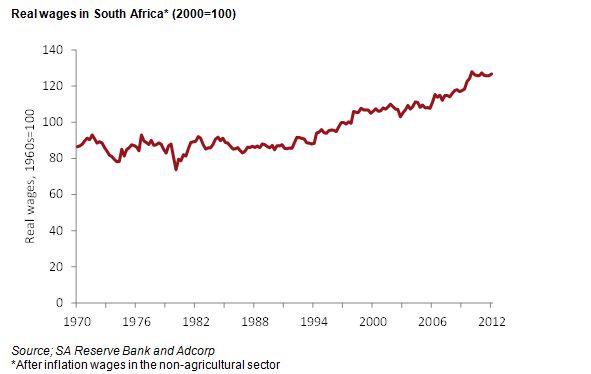
In March 2008 the total book assets of Eskom amounted to R168bn. By 2018, these assets will climb to R743bn, which is a formidable increase of R575bn (our forecast based on Eskom’s projected capex and growth). Furthermore there is now no practical alternative but to rely on Eskom to manage this growth over the next five years. Today’s burning issue is rather how much of the five-year growth in electricity generating assets should be financed with tariffs and with debt. Well within the five-year window, the energy czar will have to decide on the growth in capacity after 2018 and how it should be financed.

Key questions

Here are key questions and proposals for formulating a clear energy strategy:

1) What growth rate is the country pursuing and how does this translate into capacity requirements for Eskom? Government, which is Eskom’s sole shareholder, must provide clear guidance. Eskom’s task is to meet this strategic objective, i.e. to supply all the electricity that is demanded in SA at a price that makes economic sense. The role of Eskom and other generators as well as other distributors of electricity beyond the next five years will have to be decided as a matter of urgency, but not as urgently as setting the right price for electricity beyond March 2013.

2) What economic return on capital is sensible to meet the country’s needs? If it is too high, industry and employment suffer. If it is too low, subsidisation is required and uneconomic activities promoted. We showed through a benchmarking exercise that a real return on capital of 3% to 4% is sensible and competitive, i.e., “cost reflective”, in Eskom’s terminology for regulated utilities around the globe. Historically, Eskom’s real return on capital was too low, which led to the capacity crisis and extraordinary price increases over the past few years. Eskom has argued that an 8% real return on capital and real cost of capital are appropriate. We showed by comparison with the returns realised by public utilities in other economies and by reference to the lower expected returns on capital invested in much riskier economic activities that this is excessive and uncompetitive. Government needs to set a target for the real return on capital and let NERSA monitor that return and its key financial and operating drivers. The sensible target should be a 3.5% real return on capital, which should also be applicable to new capital investments. Cash Flow Return on Investment (CFROI) is a globally accepted measure of real return on capital, and a metric we like.

3) What is the most economic way of delivering power? This is more technical and involves the usual project economics. Burning coal has high external costs such as environmental pollution and road damage. Game changers include power stations that burn natural and shale gas, which can be built quickly at lower cost and operate more efficiently. The energy and manufacturing renaissance in the US must surely serve as a template and exemplar for government and Eskom. The die has been cast for the present expansion, but a decision needs to be made on the energy sources for the next phase of electricity capacity building beyond 2018. The importance of saving energy via awareness and innovative technology should continue to be promoted, although not necessarily by Eskom.

4) What financing and capital structure is required to fulfill this strategy? Operating cash flow is stable for power companies, which lessens risk and allows them to operate with high levels of debt and leverage. The cost of debt can be managed by government guaranteeing Eskom’s debt (as the Treasury has agreed to do) or by the RSA raising debt on Eskom’s behalf and investing the proceeds of such debt issues as equity in Eskom.

More debt vs higher charges

The choice for the economy is simple: it is either more debt, or much higher charges that damage the economy. In Eskom’s MYPD 3 five year proposals, debt would grow to R338bn (relative to book assets of R743bn and the government’s guarantee of R350bn). We estimate that if price increases were limited to 10% per annum and cash costs were reduced by 5%, Eskom would have a competitive real return on capital and debt peak of about R450bn. Surely this is an unavoidable demand on the borrowing capacity of the RSA or its wholly owned subsidiary Eskom. Government cannot abdicate this responsibility if it is to fulfill its obligation to the wider economy. And the rating agencies should be made to appreciate, as surely they will, that to raise debt to fund essential infrastructure that improves the growth potential of the economy rather than to undermine it, makes economic sense and justifies a better, rather than worse, credit rating

Another issue to consider when setting the target real return on capital invested by Eskom is whether to allow non-productive construction-in-progress as part of the return on capital and tariff calculation. We believe it should be excluded from the economic return calculation because it encourages uneconomic behaviour.

Granting Eskom the right to charge tariffs on construction-in-progress encourages it to build expensive capacity and to keep building. If Eskom is able to charge tariffs on construction-in-progress, it has no incentive to control expansion costs nor to deliver new capacity on time. These are headline issues that perpetually dog the current expansion.
Opaque subsidies

We are also concerned about the opaque practice of having Eskom subsidise poor consumers and independent power producers (IPPs). If government wants to achieve these noble aims, it should do so in a separate, transparent vehicle that taxpayers can monitor not impose an extra burden on some electricity consumers If a separate subsidised vehicle were set up for the support of IPPs, we believe Eskom’s price increase could be sensibly lowered to 7% or 8%.

Government needs to set a clear strategy with a realistic economic return on capital for Eskom. Eskom’s pricing proposal is excessive and would damage the economy irreversibly; all in the name of chasing an investment grade credit rating. We don’t know whether government or Eskom management has set this objective for Eskom, but it is misplaced. Eskom, with government’s blessing, can and should take on more debt to fund its expansion and charge a price that generates a real return on capital of 3% to 4%, excluding construction-in-progress. If this strategy were clearly communicated, the risk of regulatory uncertainty would be reduced and SA could attract the world’s leading power companies and foreign direct investment. In this way SA’s growth, competitiveness and credit rating would be enhanced. This objective is the real star.
*Brian Kantor is chief strategist and economist at Investec Wealth & Investment. David Holland is an independent consultant and senior advisor to Credit Suisse. The opinions are those of the authors’ and do not reflect the views of Investec or Credit Suisse.

The 2011 census and the labour market: Getting the nation back to work

We look at the regional and other factors at play in the failure of to employ more people and draw some conclusions about what can be done about it.

Unemployment as well as incomes varies significantly by Province.

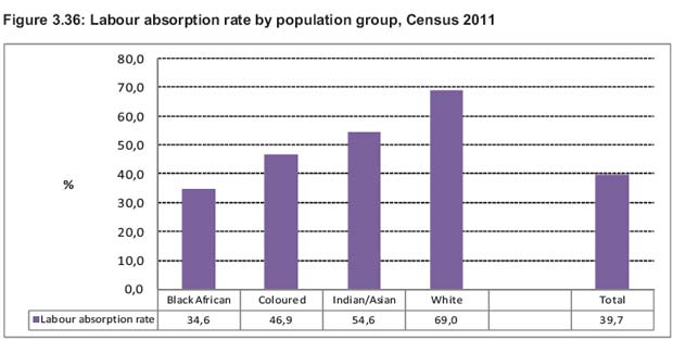
According to the 2011 Census a mere 39% of the adult population of SA is employed. The rate of absorption into the labour market varies from 70% for the white group to about 33% for households headed by black Africans (see below)


Source: Census 2011

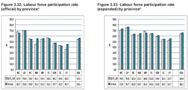
When those registered as unemployed by the census are added to those employed, the participation of the adult population in the labour market can be established. The average rate of participation of adults in the labour market is of the order of 55% of the adult population force, using the stricter definition of unemployed.


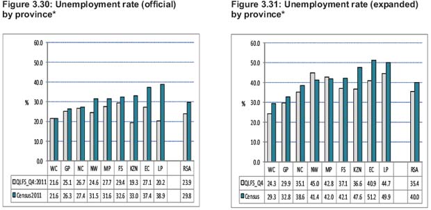
*Note The provincial order in the above two figures corresponds with the order used in the QLFS, and is therefore different from the geocode which is used in other publications.
Source: Census 2011


*Note The provincial order in the above two figures corresponds with the order used in the QLFS, and is therefore different from the geocode which is used in other publications.
Source: Census 2011

The census indicates not only significant income differences across the provinces, but also highly significant differences in the unemployment rate across the different provinces, as is shown above. The poorer the province, the higher the unemployment rate of that province and the lower the rate of participation of its adult population in the labour market. The unemployment rate ranges from about 20% in the Western Cape to nearly double 40% in Limpopo.

The participation rate in the labour force ranges from nearly 70% in Gauteng to barely 40% in the Eastern Cape. The divide between the provinces appears very much as an urban rural divide. It is the highly urbanised provinces, Gauteng and Western Cape, which deliver higher incomes and much faster growth in employment.

Population and employment has grown fastest in Gauteng and the Western Cape

The unemployment rate is lowest in the provinces to which people have migrated in significant numbers over the past 10 years: Gauteng, with net migration of over 1m people, and the Western Cape, which has absorbed over 300 000 extra people since the last census in 2001. The population of Gauteng, 12.27m in 2011, making it by far the most populous province, grew by 30% over the 10 years – twice the national average and that of the Western Cape (28%).

Clearly employment growth in the two fast growing provinces (given little change in the unemployment or labour force participation rates in Gauteng and Western Cape since 2001) has also been well above average too. The implications of these demographic and economic trends would seem to be obvious. If a greater number of South Africans are to be employed they are most likely to be employed in fast growing Gauteng and Western Cape. Or in other words, the rate of migration to Gauteng and Western Cape will have to accelerate further if the unemployment problem in SA is to be addressed in a meaningful way.

What it means to be employed, unemployed or not working and therefore not part of the labour force

According to the census, of the SA working age population (16-65) of 33.2m, only 13.18m were employed – a “labour force absorption rate” of a mere 39.7%. The census counted 5.594m workers as unemployed, leading to an unemployment rate of 29.8%. The SA labour force is the sum of the employed (13.18) plus the unemployed (5.6m) or a labour force of 18.7m potential workers. The numbers of adults defined as “not economically active” by the census numbered 14.5m. Thus, the labour force participation rate in SA was but 55.6% of the adult population of 33.2m in 2011.

The Quarterly Labour Force Survey (QLFS) conducted regularly by Stats SA counted fewer officially unemployed in 2011, some 4.24m unemployed and so an unemployment rate of 23.9% – presumably because those conducting the QLFS applied a stricter interpretation of actively seeking work. 

Those officially unemployed according to the Census would have responded affirmatively to the question in the census questionnaire (P25) “…that they had looked for any kind of job or tried to start a business in the four weeks before October 10th 2011”.

In other words you are only regarded as unemployed if you have recently actively sought work. You may not be working for a variety of reasons, including studying or having retired early or a full time home maker, or more simply because you prefer not to work. If you are neither working nor seeking employment you are understandably not counted as part of the labour force. By neither working nor seeking work your actions can have no influence on the numbers employed or employment benefits (wages and salaries) offered and accepted –hence you are not participating in the labour market.

The census asked a number of further questions as to why people were not seeking work. Among the possibilities considered  included “no jobs available in area” , “ Lack of money to pay for transport to look for work” and“No transport available”. The census also asked a supplementary question “If a suitable job was available would you take up the job within 7 days”?  A job to be regarded as suitable must include a sense of attractive enough pay as well as within easy reach of the household. Thus it is surely unlikely that any potential worker not working or seeking work would respond anything but positively to such a hypothetical, probably highly unrealistic, offer of a suitable job at an attractive wage nearby. If an attractive employment opportunity were on offer many of the currently not working in rural SA would happily take it up. But the prospect of finding such work in the rural areas is very poor. Answering yes to such a purely hypothetical question would therefore not make you a member of the labour force in the sense considered earlier, in the sense of your actions or intentions having any influence on the supply of demand for labour or rates of remuneration.

Including those who would work, if only an attractive enough opportunity were offered them, greatly increases the numbers of the unemployed. It would include as unemployed all those whose experiences seeking work and not finding it would have discouraged them from seeking work and so led them to withdraw from the labour force and to stop looking for work that is practically not available.  However should these discouraged workers be included in the ranks of the unemployed, a higher expanded unemployment rate would follow. Perhaps the census unwittingly included many more discouraged workers as unemployed compared to the QLFS.

Why those not working – especially in rural SA – should be regarded as not working and therefore as not part of the labour force or unemployed

For many potential workers, particularly in the rural areas of SA, the knowledge that there is no realistic chance of a job in the area does not make them unemployed and therefore they are not part of the labour force.

Workers in rural areas might be willing (even if reluctantly) to accept employment at lower wages if given the opportunity to do so within easy reach. The clothing workers in Newcastle, KwaZulu-Natal, provide such  a case study. The reasons why there are in fact so very few jobs offered in the rural area may have a great deal to do with the regulation of wage rates (minimum wages and nationwide wage agreements for example).

These regulations discourage potential employers, using labour intensive methods, from offering employment at lower wages that workers outside the major urban areas might well be willing to accept, as an alternative to not working. It is perhaps only lower wages that can make rurally based enterprises competitive with those employers operating in the urban areas. In the major centres, well established firms are able to provide better employment benefits, because of all the other advantages an urban area offers to business, for example, being close to customers or transport nodes and having easy access to essential services and skills. These advantages are not typically available in more remote regions and the opportunity to pay lower wages may be the only reason for operating in a more rural location.
The realistic alternative for many potential workers now not working in the rural areas is to seek work in the cities where opportunities to seek and find work are a realisitic alternative. When typically younger workers migrate to the urban areas to seek work they qualify as part of the potential labour force – and hopefully they will be only temporarily unemployed. Their decisions to migrate to the cities will have an impact on the labour market in the urban areas.

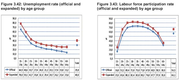
It is not accidental that labour force participation rates in SA (those in work and looking for work) as a percentage of the adult population peak at between 70% and 80% for the cohorts between the ages of 25 and 45. (see below)


Source: Census 2011

But potential workers, by electing not to migrate to the cities of opportunity for whatever reasons, are unlikely to ever be able to find work in the rural areas in significant numbers. But it makes little economic sense to describe such non-workers as unemployed. They are however part of a potential labour force that, with very different economic policies, might become a much more productive part of the labour force.

Regional policies to encourage employment and participation in the labour force

Such policies might usefully include better, well targeted Budget support for those urban regions of the country that have proved able to create additional employment. The right policies might include better funded housing, schools, vocational training and hospitals and the transport systems that could make these regions still more attractive to potential migrants and potential employers.

Poverty relief in the form of cash grants provided on a means tested basis to support children, the aged or the disabled can and has had the unintended consequence of discouraging entry into the labour market, especially from the rural areas of SA. As economists put it, such support for poor families raises the reservation wage of labour: it raises the wage that makes it worthwhile to accept or even seek work. Such work, at wages attractively higher than the reservation wage, may simply not be available in significant volumes outside of the urban areas.

It should be understood that for the unskilled the only work available might be physically onerous work at relatively low wages. But the incentive to work or seek work does depend on the improvements in the household’s standard of living that may be realised by some family members accepting work (or by not seeking or accepting work by subsisting on the welfare system) or the family relying on some mixture of work and welfare.

The fact that the participation and employment rates in the labour force are so much higher for the average white than the average black SA resident has everything to do with these economic incentives. The white South Africans participate much more fully in the labour force because they can earn much more on average than they could expect from welfare.

Conclusion: the path to faster growth in the labour force

The best form of poverty relief in the long run is the creation of employment opportunities and of the skills that qualify workers for higher earnings. The best prospects for employment and income growth in SA are in those regions that have performed so much better in attracting and employing labour. Improving the economic performance of the provinces with competitive advantages should be a clear objective of economic policy. In this way the successful regions can better facilitate the creation of higher incomes and employment over time. Allowing for more flexibility in wage determinations across a diverse geography should be another.

Spending signals: Rumours of the death of the SA consumer may be exaggerated

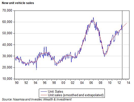
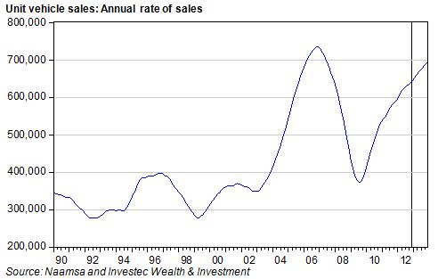
The first indicators of economic activity in November 2012 are now to hand, in the form of new vehicle sales and the value of Reserve Bank notes in circulation. Unit vehicle sales in November were marginally down on October sales, when adjusted for seasonal influences. Unit sales, seasonally adjusted, appear to have stabilised over the past three months at about the 53 000 per month rate, equivalent to about 645 000 units sold annually. When monthly sales are annualised, smoothed and extrapolated, unit sales appear to be still on an upward path and are heading for 695 000 units in 2013 compared to sales of about 645 000 in 2012.

This, if achieved, would represent growth of about 7.5%, and would take domestic unit vehicle sales close to their record levels of 2006. This would be regarded as highly satisfactory in circumstances of generally subdued spending growth. What with built up exports picking up strongly, to over 28 000 units in November (well up on the pace achieved earlier in the year), the sector involved in manufacturing, assembling and distributing new vehicles is a source of growth for the economy. Lower interest rates have probably helped and will continue to do so.

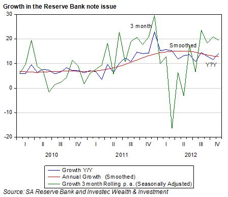
The supply of notes issued and demanded in November 2012 – a very good indicator of household spending intentions in the crucial month of December – continued to grow very strongly. As we show below, growth in the note issue, on a three months seasonally adjusted basis, has maintained the strong recovery that began in the second quarter of 2012. On a smoothed basis, annual growth in the note issue is running at about 13% p.a, indicating continuing strength in household spending.

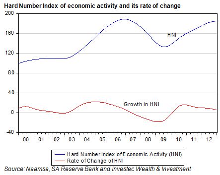
We combine the note issue with unit vehicle sales to form our very up to date Hard Number Index (HNI) of the state of the SA economy. Our HNI for November indicates that the SA economy continues to move ahead at a more or less constant speed. Numbers above 100 indicate growth while the second derivative of this measure of the business cycle – the rate of change of the HNI – indicates that the pace of growth is slowing down but only very gradually (see below).

This up to date news about the state of the SA economy in November 2012 should be regarded as encouraging. The strong demand for cash at November month end indicates that the tills will be ringing loudly this December, given that spending in December at retail level is 36% above average spending month. The demand for new vehicles suggests that households and firms have not given up their taste for big ticket items. Rumours of the death of the SA consumer may well be exaggerated. Brian Kantor

Money supply and credit: Seeking encouragement

The news from the credit and money supply fronts is not very encouraging. Money and credit supplies need encouragement from lower interest rates, not discouragement from ill timed regulatory intervention

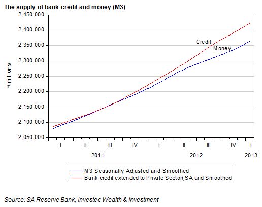
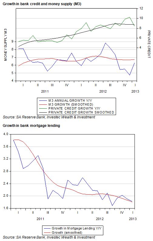
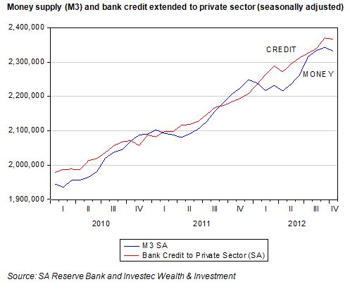
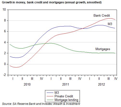
Broadly defined money supply (M3), as well as bank credit extended to the private sector declined marginally in October 2012 on a seasonally adjusted basis. Annual growth in these aggregates, when smoothed, also declined marginally. The broadly defined money supply, mostly made up of deposits with the banks, is now growing at an underlying rate of about 6.6% p.a. while underlying growth in credit extended to the private sector is about 8.2% p.a. Mortgage lending by the banks is growing at an even slower rate of about 2% p.a.


It should be appreciated that these are very modest growth rates, especially given inflation of the order of 6% p.a. With the economy operating well below its potential, it needs all the help it can get from domestic spending and the support money supply and credit growth give to domestic spending. With export prices and especially export volumes under severe pressure, household spending has been supporting economic growth and so the employment and incomes of employees. This helps them maintain their credit.

At this especially vulnerable stage for the SA economy, attempts to reform the credit system in SA are especially likely to lead to less credit being offered, less spending and still slower growth in incomes. Any additional restraints on the willingness to supply credit or to secure credit are precisely the wrong recipe. They are likely to lead to more, not less, distress in credit markets as the economy slows down. Brian Kantor

The case against Eskom – redux

In our last edition, we argued that Eskom’s request for price increases, if agreed to by the regulator, would provide Eskom and its shareholder (the Republic of SA), with an unnecessarily high return on capital, some 8% per annum after inflation. We go into some of issues in more detail today, notably the use of depreciation allowances in setting prices.

We indicated that this expected return is more than twice the international norm and that if Eskom gets its way it will possess a very strong balance sheet by 2018.

The key is that this balance sheet strength can only come at the expense of its customers. As we have argued, the right prices for electricity for SA are those that would generate a 4% real return on the extra capital Eskom will be investing in new generating and distribution capacity. Such returns would put the economics of electricity pricing first and would make the state of Eskom’s balance sheet very much a secondary consideration. Moreover, it would still leave its balance sheet in a highly acceptable state for the low risk business it is.

The logic of the investment decision

All projects requiring an investment of scarce capital that offer a positive present value, given some appropriately estimated cost of capital, or discount rate, should ideally be undertaken in the interest of economic growth and efficiency. One of the primary principles applied to the decision as to whether or not to proceed with a project, be it a green-field project or an acquisition of another company, is that the economic and financial decisions should be separated.

The first question to be answered by any agency contemplating investing capital is the economic one. After estimating the extra revenues and operating costs related to the project it can be established whether or not the present value (PV) of these estimated operating cash flows exceeds the intended capital expenditure, given its cost of capital or required risk adjusted return (the discount rate). If the answer is affirmative the next question can be addressed: How best should the project be financed? When extra capital has to be raised from the market place it is the suppliers of capital that will decide whether the project that seems so promising to its originators can in fact go ahead.

At this point in the evolution of the planning process for additional capital expenditure judgments about the structure of the capital to be raised can be made. The presumed riskiness of the project and the strength of the balance sheet will influence the cost of raising additional debt finance. Also relevant will be the tax treatment of the project. Allowances for interest and especially depreciation expenses or investment allowances will make a difference to taxes levied and after tax returns. The firm and the market will compare the after tax, risk adjusted returns of this project with its next best, equally risky, alternative. Clearly if the internal rate of return (derived from operating cash flows) from a project with a limited economic life exceeds the interest cost of debt plus debt to be repaid over the same period, leverage will add to operating profits after taxes.

Why the depreciation allowance should not be regarded as a cost to be covered by regulated prices

A further important point that seems to be disregarded by both Eskom and Nersa is that depreciation allowances are not a cash cost of production. They do however affect taxes paid and bottom line accounting earnings and after tax returns. When estimating the PV of any project these depreciation allowances should not be deducted from operating cash flow when a project is accorded a limited economic life.

Allowing for depreciation on top of maintenance costs would clearly reduce the PV of the cash operating surpluses expected over the economic life of the project. A regulator including depreciation as a cost of production may then allow higher prices to be charged to achieve positive PV projects. This treatment of depreciation as a cost to be recovered in prices would represent a logical fallacy.

Economic depreciation is implicit in the economic life accorded to any project. The shorter the life allowed a project the lower the PV of the cash flows and so the faster the capital is being written off and vice versa: the longer the economic life the greater the present value of any flow of operating cash. It is simply wrong to add depreciation to operating costs when present valuing any project with a limited economic life. It leads to underestimates of PV and so fewer projects qualifying with a PV that exceeds their capital costs. When prices are set by a regulator, it leads to unnecessarily higher prices.

Eskom asks for more than ordinary depreciation allowances – it asks for cost and price inflating replacement cost depreciation

Eskom however has another trick up its accounting sleeve. It argues that the costs it is required to cover with prices include not only conventional depreciation for accounting purposes but so called replacement cost depreciation: a depreciation allowance of 10% p. a. This is applied to the capital equipment employed that is continuously revalued by their higher, inflation augmented, costs of replacement by new equipment .This gives a much higher value for the capital employed and so a much much higher depreciation charges (Eskom hopes) to be recovered through higher prices.

When estimating present value and finding projects with a present value that exceeds their cost depreciation allowances should not be included in costs to be recovered

It should be recognised that depreciation allowances should have no place in the regulator’s calculation. The right price for electricity is the price that would allow revenue to cover all cash operating costs plus the right return on capital – no more than 4% real – on additional electricity generating or distribution capacity that Eskom plans to invest in. Prices set by the regulator should be set to yield a positive PV using this 4% real discount rate (before taxes). If Eskom can justify such projects (which it surely can) then such projects should be financed with a high ratio of debt finance. Brian Kantor

The case against Eskom and its debt management driven price demands

The Eskom initiative for higher prices

Eskom has submitted its Multi-Year Price Determination (MYPD 3) to the National Energy Regulator of South Africa (Nersa) in which it is requesting annual electricity increases of 16% until 31 March 2018, of which 3% is targeted to support the introduction of Independent Power Producers (IPPs). This leaves a monstrous post-inflation increase of over 10% per annum for five years, which threatens the livelihood of small, energy-intensive businesses and the country’s citizens. On what basis does Eskom argue for such vigorous price demands?

What the Eskom balance sheet would look like if it gets its way with prices

If Eskom has its way with the regulators and the politicians on its plans for prices and costs, it will become one of the great companies of the world. It will be possessed of a balance sheet that would be the envy of the world, especially of the world of public utilities. By 2018 it would have assets that at replacement costs would have a value of over R1 trillion, more than three times its R300bn of debt.

The company would then command a AAA debt rating (better than that of the SA government) assuming this is technically feasible. It would incidentally be very helpful to ourselves and also Nersa were Eskom to present pro-forma balance sheets, income and cash flow statements over the five year planning period. It would be even more helpful if Eskom could present the outcomes of alternative scenarios for the balance sheet and debt ratios with lower prices.

Our overwhelming reaction to these Eskom proposals is just how ambitious and dangerous they are for the health of the SA economy.

Why Eskom behaves as it does and why it may be mistaken about the demand for electricity at much higher prices

We will leave it to others better qualified to examine and justify the much higher operating costs (mostly primary energy and employment costs) of generating extra capacity Eskom hopes to recover with higher prices. We have a strong sense that only time could prove – and hopefully will not be allowed to prove – that Eskom is greatly underestimating the real price elasticity of demands for its electricity as well as the opportunities it will open up for firms and households if Eskom gets its expensive pricing way to substitute (a la Sasol) locally generated power. Excess Eskom generating capacity may well become a feature of the future as it was of the past if the forecasts of demand prove over optimistic.

The new, already much more favourable financial reality for Eskom

In reality Eskom is now charging much more. The price charged by Eskom per kWh was 16.2c in 2006, which nearly doubled to 31c in 2010. These charges have since nearly doubled again to the current 61c per kWh. On top of these steep increases, municipalities that deliver electricity charge much more to their industrial and household customers than the Eskom wholesale price. As a result Eskom, after years of artificially low prices, is now earning an internationally comparable real return on all the capital it has invested. Eskom’s median cash flow return on operating assets (CFROI®) troughed at a negative level (-2.5%) in March 2009 at a time new generating capacity was essential to the functioning of the South African economy. CFROI represents the real economic return on inflation-adjusted capital and is comparable across borders and over time, making it an excellent benchmarking metric.

If we strip out the R159bn of presently non-productive construction-in-progress, Eskom’s CFROI improved to an internationally competitive 3.3% by March 2012. Our sense is that such a return, if maintained, would be sufficient to justify investment in additional capacity. With appropriate control of costs, revenue so generated will deliver enough cash from operations to support the balance sheet of a utility company that can typically sustain comparatively high debt ratios – given the essentially low risk nature of its business.

In the financial year to March 2012 Eskom undertook capital expenditure of R59bn. But given the abundant supplies of cash delivered from operations of R38.7bn, Eskom needed to raise only R16.5bn of additional debt in the last financial year compared to R30.5bn of debt raised in 2009. Eskom’s debt to equity ratio is falling significantly as we write.
It is the future of Eskom, not its past that matters when prices are set. Current prices plus inflation would be highly satisfactory returns on the investment being made in additional capacity.

More important than the historical performance is that at the current 61c per Kwh, assuming inflation adjusted prices and not much more than inflation adjusted costs going forward, the internal rate of return on its investment in additional capacity at Medupi or Kesuli power stations would be a more than satisfactory 14% p.a. That is a internal rate of return of six per cent per annum higher than what it costs the SA government to raise long term money. 14% nominal is equivalent to a real internal rate of return of 8% which, as we will argue, is excessive by comparison with global returns for utility companies.

The importance in choosing the right risk adjusted cost of capital for the regulator

The most important issue for any business or any regulator attempting to replicate the market process is just what this rate of return should be to justify an investment in a new project. It follows that the more risky the project is, so the higher will be the required return or discount rate applied to the project.

Electricity generation – especially where the regulated generator or distributor has a high degree of monopoly power – is among the lowest risk projects available in any economy. Demands for electricity are highly predictable compared to most other goods or services and the technology for coal fired stations is very well established.

Why Eskoms’s real cost of capital estimated at over 8% is double the required rate of return

Our major difference with Eskom and Nersa is that Eskom is demanding an exceptionally high real return on the capital it has invested and plans to invest. Last year, the median CFROI was 3.2% for the 100 largest listed electricity companies in the world.

The CFROI for power companies has been remarkably stable, averaging 3.5% over the past decade. For example, Electricite de France (EDF), one of the largest power companies in Europe, has a 10-year median CFROI of 3.6%. Malaysia’s Tenaga Nasional Berhad posted a 10-year median CFROI of 2.6%. Regulated utilities are generally fortunate to be granted a 4% real return on capital. There is no precedent for a real return as high as 8% for a regulated utility and Nersa should dismiss such assumptions about what is an appropriate return for a utility. A real return on capital of 4% should be more than sufficient in a country that requires greater growth to put people to work and place poverty behind us.

Eskom appears to have succeeded in convincing the regulator that 8% is a “reasonable (real) return on assets.” The market-implied real cost of capital for listed SA industrial companies has averaged 5.5% over the past decade. Listed firms, where shareholders are subject to the possibility of 100% downside, are far riskier than a government owned utility. Less risk should mean less return. A real return on capital of far less than 5.5% strikes us as reasonable for Eskom. Our benchmarking points to a 3.5% p.a real return as being globally competitive.

Why Eskom puts debt management first in its concerns when requesting price increases and why it makes little sense given its ownership

It is very clear that Eskom prefers, for its own reasons, not to separate the investment and financial decisions. Its primary objective in setting prices seems to be to strengthen its balance sheet excessively and unnecessarily. Hence the justification for extraordinary – way above required returns on capital – price increases rather than via brilliant control over costs or engineering competence – a success we all would approve of and share in.

We can argue whether or not electricity generating capacity in SA should be privately owned. We would argue for many, rather than only one, management teams responsible for electricity supply and so much more competition between alternative suppliers. It is however ironic that Eskom should wish to deny itself its primary advantage as a wholly owned subsidiary of the Republic. It can depend on the balance sheet of the Republic and by so doing borrow on the same favourable terms.

This facility would not make any difference to Eskom’s cost of capital or required – but relying on the balance sheet of its powerful shareholder would allow lower costs of finance and more debt with which to fund viable projects. If the internal rates of return realised by Eskom exceed the costs of finance, leverage adds significantly to the bottom line and the return on equity capital.

No doubt it is much more convenient and rewarding for the management of Eskom to enjoy financial independence and its own strong balance sheet and the bonuses that presumably come with high operating margins, earnings growth and very high returns on capital. But when this is achieved with excessively and unnecessarily high prices by exploiting its monopoly powers, this does not suit the SA economy at all. The demands of Eskom should be vigorously resisted by the regulator and public opinion. Brian Kantor and David Holland*

*David Holland is an independent consultant and senior advisor to Credit Suisse. The opinions are those of the authors’ and do not reflect the views of Investec or Credit Suisse.

A strange moment for the rand

The mystery of the strange behaviour of the rand yesterday (Wednesday) has been solved. Sudden rand weakness had nothing to do with South African events: it weakened suddenly around 11h30 in complete sympathy with a simultaneous decline in the exchange value of the Brazilian real.

As may be seen in the chart below, both currencies weakened significantly at about this time. Hence the rand weakness can be described as a response to emerging market rather than SA specific risk. To deepen the mystery further however, other emerging market currencies, such as the Turkish Lira and the Mexican peso, did not react in anything like the same way. The mystery therefore is to recognise those forces that simultaneously weakened the Brazilian and SA currencies. As for now, this remains something of an unsolved mystery.

The JSE moreover did not react to rand weakness, as might ordinarily have been expected. Retailers, who are particularly vulnerable to rand weakness and the higher import prices that come with it, held up very well and the rand hedges – both of the Industrial and Resource kind – did not outperform.

What Brazil and SA have in common are iron ore exports to China. There was a conference call yesterday organised by one of the institutional brokers on the proposed reduction in Chinese domestic iron ore tax, where it was stated that a more favourable tax treatment of domestic iron ore producers might well reduce the Chinese demand for iron ore imports.

This episode in the currency markets perhaps illustrates once more how important China is to the outlook for commodity prices. Yesterday was not at all a bad day for commodity prices. Iron ore fines were quoted at prices only marginally ahead of the day before and nearly 8% higher, year to date, while the CRB Commodity Price Index was unchanged on the day. Brian Kantor

Striking the rand

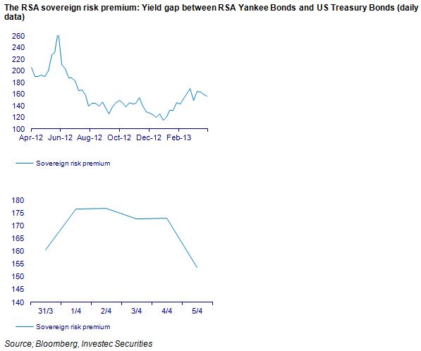
The troubles on the mines and now the farms of SA have hurt the rand. The rand is now significantly weaker than would have been predicted given the behaviour of emerging market equities and RSA sovereign risk spreads.

These two factors provide a very good explanation of the rand/USD exchange rate on a day to day basis. As we show below, the rand is about 12% weaker than predicted by this model of the rand.

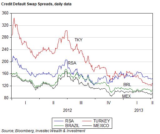
As may be seen below, the MSCI emerging market index has held up over recent months, as has the cost of insuring against a default on RSA foreign currency denominated debt with a five year credit default swap.

However, as may also be seen, RSA debt has derated in recent months. Compared with Turkish, Russian. Brazilian or Mexican debt, the costs of insuring RSA debt has become relatively more expensive.

Yet compared to the past, the SA risk spread remains very low by its own standards, at 150bps above the returns on US five year debt.

The exchange value of the rand will continue to be driven by global economic forces, as revealed by: the value of emerging market equities, the risks associated with SA (shown in the debt markets) and now also by SA specifics in the form of strike action. The markets will assess not so much the incidence of strike action, but its expected impact on the economy, notably exports and domestic economic activity. The challenge for the SA government is to reform its system of labour relations to make strike action less likely and less violent; and employment growth more likely. Brian Kantor

Domestic spending: Encouraging October

The demand for cash supplied by the Reserve Bank continued to grow strongly in the three months to October 2012. As we have explained before, the Reserve Bank note issue has proved to be a very good indicator of the spending intentions of SA households.

As we show below, the demand for cash fell off in early 2012 but picked up very strongly from mid year. Over the past three months the note issue, seasonally adjusted and annualised, grew by a robust 21%. As we also show, the growth in the broader money supply – mostly in the form of deposits issued by the banks – grew similarly in the three months to September month end.

Unit vehicle sales have followed a very similar trajectory to the note issue (adjusted for inflation), losing momentum in the first half of 2012 and then recovering strongly to October.

Unit vehicle sales and the note issue (adjusted for the CPI) make up our Hard Number Index (HNI) of the state of the economy. The HNI has two advantages: it is very up to date (updated to October 2012 month end) and it is based on actual recorded volumes (hard numbers) rather than the estimates made from sample surveys.

Given the strength in both vehicle sales and cash volumes, the HNI indicates that the economy has continued to move forward at a good pace. Its rate of growth – what can be regarded as the second derivate of economic activity – however continues to slow down. The indications therefore are that the SA economy is continuing to move forward at a good pace but that its forward momentum is slowing.


Other data releases for October – to be released in due course – are likely to confirm that domestic spending intentions and actions remain robust, surprisingly perhaps to the market place.

The figures for the note issue and unit vehicle sales are the first data posted for the economy post Marikana. It would appear that the strike action on the mines and roads of SA have had little negative influence on spending intentions. This resilience of domestic demand is very welcome when foreign demand is growing as slowly as it is, given the weak state of the global economy. If the economy is to retain its growth momentum, which is essential for political stability and a satisfactory fiscal state of affairs, it will continue to depend on the domestic spender. Domestic spending is being encouraged by low interest rates, which can be expected to stay low until global economic conditions improve.

The Census reports good real progress in household incomes and household numbers

The general impression provided by the census is that significant economic progress has been made in SA over the past 10 years. There are now 14.45m identified households, 28% more than were counted in 2001. Average household incomes of R103 204 were reported compared to R48 305 in 2001. That is an increase of 113% in money of the day terms. Given that the CPI increased by 77% over this period, this implies a real increase of approximately 36% in average household incomes over the 10 years.

The poorest SA households are those led by black Africans. However they did significantly better than the average SA household. Households headed by black South Africans increased their average household incomes by 169% in current prices or by nearly double, when adjusted for inflation between the censuses of 2001 and 2011. The objective of advancing the previously disadvantaged has been met about as well as the government could have realistically hoped for.

The census is consistent with National Income estimates

These increases in self assessed incomes, in response to the question asking respondents to estimate “gross monthly or annual income before deductions and including all sources of income” compare very well with the growth in per capita incomes as estimated by the National Income Accounts. Gross National Income per capita in real terms grew by 35.5% between 2001 and 2011 or at a compound average growth rate of 3.04% p.a. Such growth rates in per capita or average household incomes represent much more than the much despised trickle down. If growth is maintained at this rate over the next 10 years this would represent a doubling of average incomes in 20 years and significant economic progress indeed.

One of the benefits of higher incomes is more and smaller households

It is not surprising, given an improved standard of living, that the number of identified households has increased much faster than the population itself. The population grew from 40.58m residents in 2001 to 51.77m in 2011, an increase of 14.2%, compared to the larger 28% increase in the number of households. Many more family members have had the means able to form households of their own.

The average SA household therefore consists of a surprisingly few 3.58 average members in 2011 compared to a similarly few 3.62 members in 2001. Perhaps this small average household is attributable to the large number of female led households with presumably no males of working age to add to household income or numbers. Households led by women earn significantly less than the average. (see below)

The composition of the housing stock

Of the 14.4m housing units identified by the census the great bulk are formal houses or apartments. 1.14 units are described as traditional, 1.249m as informal dwellings (stand alone shacks) with a further 713 thousand shacks in back yards. The ownership structure of these housing units makes interesting reading. Nearly 6m of the units are identified as owned and fully paid off (See below). It is these owners who surely make the most reliable and sought after recipients of unsecured loans.

Stuff at home

These homes – owner rented and mortgaged – seem very well provisioned with household appliances and consumer goods. 10m refrigerators and 11m stoves were identified, together with 4.5m washing machines and more computers, 3m, than vacuum cleaners. 10.7m TV sets entertain the stay-at-homes backed up by as many as 8.5m DVD players and unsurprisingly, 13m cell phones.

Large differences in provincial income –or is it an urban / rural divide?

Much larger differences in household incomes are however recorded by the different provinces. Average household incomes are highest in Gauteng (R156 243) and the Western Cape R143 460 – almost three times as high as average household income in the poorest provinces (See below).

These income differences may be regarded as more of an urban-rural divide than a provincial one. The gap between household incomes in the Durban metropolitan region and that or rural KwaZulu-Natal is probably every bit as wide as it is between Gauteng and Limpopo.

Higher incomes mean greater opportunity and so migration – a force to be recognised in advance and encouraged

It is these differences in incomes and income earning opportunities that understandably have led to large numbers (presumably mostly younger men and women) migrating to Gauteng and the Western Cape. Over a million people have migrated to Gauteng over the past 10 years and over 300 000 to the Western Cape. The Eastern Cape has seen net outward migration of 278 000 persons, mostly to the Western Cape, and in Limpopo Province: a net 152 000 residents have migrated to other provinces, mostly to Gauteng.

Migration plus population growth has seen the population of Gauteng increase from 9.38m in 2001 to 12. 27m in 2011, an increase of 30%. This makes Gauteng by far the most populous SA province. The population of the Western Cape has increased by 28% over the 10 years to 5.8m people, more than the population of the much poorer Eastern Cape.

Since transfers from the central government to the provinces are based on the size of their populations, these developments have significant budgetary implications. The argument that the governments of the Western Cape and Gauteng will make is that with migration of this order of magnitude, 10 years is too long to wait to adjust budgets in recognition of population growth and the additional demands growth n population makes on provincial budgets.

However the logic behind the allocation of funds to the provinces based on existing populations, rather than their economic potential, should be questioned. If economic and employment growth were the objective of economic policy then it would surely be better to back the winning provinces – those that offer significant employment and income opportunity – rather than redistribute taxpayers’ contributions to those provinces where economic prospects and achievement are so lacking. The economic potential of SA, as everywhere in the world, lies in the urban not the rural areas. Brian Kantor

Retailers: Making sense of retail sales volumes and the value of JSE Retail counters

Retail sales volumes in August 2012 were up nearly 2% in August when measured on a seasonally adjusted basis, or 6.5% ahead of their December 2011 volumes. (See below)


Apparently the buoyancy of sales took economists somewhat by surprise. However observers of the note issue and unit vehicle sales (updated to September 2012 month end) that make up our Hard Number Indicator of the state of the SA economy, should have been less surprised. The retail volumes follow the pattern established by both vehicle sales and the real note issue. That is, growth in volumes, seasonally adjusted, when calculated on a three month rolling basis, picked up strongly towards year end 2011, then fell back sharply in early 2012, whereafter growth accelerated again. (See below)

As we have suggested, and has been confirmed by the strength in retail sales volumes, the SA economy has had more life in it than has generally been appreciated.

The stock market was perhaps less surprised by the strength in retail sales, given the recent strength of the General Retail and Food and Drug Indexes on the JSE. The value of the JSE General Retail Index, in real CPI adjusted terms, has increased by 35% between January 2011 and 17 October 2012 with much of this strength coming in 2012. Real sales volumes grew by 10% between January 2011 and August 2012.

The valuations of retail companies have clearly improved significantly faster than those of real sales. They have also outpaced real retail earnings per share, leading to elevated ratios of share prices to earnings of the retail counters, as has been well documented. However what has not been as well recognised is the extraordinary growth in real dividends distributed by the retail companies. Dividends per retail index share have grown much more rapidly than earnings per share. Dividends in fact have not only grown faster than earnings – 2.64 times as rapidly since 2002 – they have also outpaced the increase in the retail Index as we show below.

Thus, while the price to earnings multiple attached to the general retailers in SA has increased significantly since 2002 (from 9.32 in early 2002 to the current 19.6 times) the price to dividend ratio has in fact fallen since 2002, from R40 paid for a rand of dividends in January 2002 to a mere 31.3 times today.


Retail companies listed on the JSE have benefitted from strong growth in sales and stronger growth in bottom line earnings as operating margins have improved. But they have also been able to generate strong growth in free cash flow – that is cash generated after increases in investments in working and fixed capital. The strength of their balance sheets, or perhaps an inability to find sufficient opportunities to deploy cash inside their businesses, has encouraged the retailers to pay out cash to their shareholders in the form of share buybacks and a reduction in earnings cover. The ratio of earnings to dividends per share has declined dramatically over the years, a decline that appears to be accelerating.


These dividends per retail share (in US dollars) have grown at an average compound rate of about 27.1% p.a since 2003 and have clearly had great appeal for foreign investors who have come to hold an increasing proportion of the shares in issue while SA fund managers have (regrettably) reduced their stakes. The Index in US dollars (excluding dividends) has increased at an average compound rate of 24.9% p.a over the same period.


Dividend yield and growth in dividends that SA retailers have been able to generate have had particular appeal in a world of very low interest rates. The exceptional returns provided by SA retailers in recent years are therefore not at all surprising in the circumstances. Their valuations – seen as a dividend rather than an earnings plays – make every sense. Brian Kantor

Outrageous pricing is bad for economy’s competitiveness

SOUTH African Airways (SAA) is a wholly owned subsidiary of the Republic of South Africa, as is Airports Company South Africa (Acsa).

SAA has run out of cash and has been given authority to raise R6bn in debt guaranteed by taxpayers to keep flying.

Acsa, by contrast, is awash with cash. For the financial year to the end of March, it generated R2.9bn in cash flows on customer revenues of R5.8bn — compared with R1.7bn on revenues of R4.6bn the year before. Last year, SAA generated just R278m of cash flow on income of R22.8bn.

This very different state of affairs is not coincidental. Acsa’s gains have been the losses or sacrifice of revenues that SAA and other airlines have had to make in favour of Acsa’s tariffs. SAA is almost certainly Acsa’s largest customer — the collector of the bulk of the fees paid by airlines and their passengers for the use of Acsa’s airports. These fees have risen significantly in recent years and account for a large proportion of what we pay to fly. The revenues the airlines can collect from their passengers is constrained by competition between them. There is no such constraint on the charges Acsa can levy given its near monopoly over all the airports in South Africa.

Acsa has not been shy to exploit its pricing power and neither the regulator nor the Competition Commission has acted as much of a constraint on the exercise of this monopoly power. An increasing proportion of the gross price per passenger flight that the market for air travel will bear, is being collected by Acsa at the expense of the airlines.

This is an issue recognised in economics as the pipeline problem. If you own an oil well or a coal or iron-ore mine and somebody else owns the only pipeline to the port, you are at their mercy. The owner of the transport monopoly can extract all the surplus you might otherwise earn from your mining operations — which is why the mine owners would do well to either own the lines to the market or sign very long-term leases for their use on terms that make economic sense.

Failing that, they may have to rely on the mercy of the regulators, who may control tariffs. The regulators, however, may be inclined to exaggerate the returns required by the owners of very low-risk rail, pipelines and ports, and so allow them to charge more heavily than would be the case were the ports and the lines to compete actively with each other for business. There is every reason to suspect the regulators in South Africa of this bias.

The government has invested on the ground and in the air. The airline business is notorious for the poor returns provided for shareholders while passenger numbers have soared over the years. The major airlines would have done much better to have invested in airports as well as fleets of airliners — as indeed the government, which owns SAA and Acsa, has done. It therefore makes economic sense for the government to keep SAA going — if only to collect the fees Acsa is able to charge. It would also make sense for SAA to be competently managed so that it, as well as Acsa, could contribute dividends and taxes to government revenues and help relieve the burden on ordinary taxpayers.

Another wholly owned subsidiary of the government (and also awash with cash) is Eskom. With much higher prices for the electricity it generates and delivers, cash is pouring into the utility. Some ball-park numbers taken from Eskom’s financial statements will help to make the point. In 2009, Eskom’s cash flow from operations was R5.16bn on revenues from electricity sales of R53.09bn. In the year to March, cash flow from operations was R38.7bn on sales of R114.7bn. Since 2009, cash flows from operations have increased 7.5 times on sales revenues that have grown 2.16 times. This shows how freely the cash flows from all the established capacity when prices are allowed to increase as they have done.

Eskom continues to invest in new capacity. In 2009, it spent R44.7bn on new plants and securing fuel supplies. This year it has spent nearly R59bn for the same purpose. But given the abundant supplies of cash delivered from operations (R38.7bn this year), Eskom needed to raise only R16.5bn of additional debt in the past financial year compared with R30.5bn of debt raised in 2009. Eskom’s debt-to-equity ratio is falling significantly. No doubt this is to the satisfaction of Eskom’s management and the Treasury. But whether such extreme trends are good for the economy is moot.

What is the required return on capital invested in monopoly airports or electricity generators? The justification for higher prices is that they are needed to provide an economic return on the additional capital Eskom is investing in more plant and equipment. The principle of charging enough to cover the full costs of additional capital investment in additional capacity desperately needed by a growing economy is entirely valid. Prices have to be only high enough to cover operating costs as well as to provide an appropriate return on the additional capital invested.

A critical consideration is what return on capital is appropriate for this. The National Energy Regulator of South Africa regards a real return of 8% a year as appropriate for Eskom. Such a return is far too high given the nature of a monopoly utility business that is essentially a very low-risk activity. To aim at a return of about half of this would be about right for the owners of airports or power plants with monopoly rights. A real return of 4% is equivalent to a nominal return of about 10% or about 2% a year above the return on an South Africa long-dated bond. A risk premium of 2%, or about half the average equity risk premium, is consistent with a very low-risk enterprise. The global average real return for utilities of all kinds is about 4% a year.

My own spreadsheet on Eskom indicates that if it gets its preferred way for 90c/kWh, compared with the current 60c, the internal rate of return it would realise on its investment in new power stations, Medupi and Kusile, would be an extraordinary and outrageous 20% a year or more. The potential providers of alternative energy or of contributions to the grid will be cheering Eskom all the way to the bank.

Providing for a real return of 8% or more represents very expensive electricity or airports, even assuming best practice in the management of projects and supplies that may not be justified given such a comfortable financial environment. Inappropriately higher charges by state-owned enterprises, designed to realise much higher real returns on capital, while convenient for the boards and managers of Acsa and Eskom, are very bad news for the economy and its competitiveness. The much better alternative would be an agreed and much lower charge for capital — leading to lower prices for essential services and an insistence on best-practice cost management. It would mean less abundant cash flows for the utilities supplying the service and more debt on their balance sheets (guaranteed by the taxpayer), and so a more competitive economy.

It would also represent a pricing policy that is much fairer to current generations. Under the present practice of forcing savings from consumers through excessive charges for utilities, charges that should better be described as taxes, future generations will inherit the capital stock without the debt that they might appropriately be expected to be still be paying off over time.

Perhaps it might also lead to a fairer labour market in which strike action by relatively well-paid workers is apparently being encouraged by inroads being made on their real wages by ever-higher utility charges.

The SA economy: Hard numbers confirm the reliance on spending

We regard the note issue as a very reliable indicator of spending intentions in SA. It has a particular advantage in that it is updated every month with the release of the Reserve Bank balance sheet, usually within the first week of the next month. The Reserve Bank has now published its balance sheet for September and as we show below, the note issue, on a seasonally adjusted basis, grew strongly towards year end 2011, then moved largely sideways until May 2012 and since then has grown quite strongly. The note issue, seasonally adjusted in September 2012, maintained this strong upward momentum in September and is now well ahead of its level in December 2011.


The strong recovery in the note issue is well demonstrated by the growth measured on a three month rolling basis. This three month growth in the seasonally adjusted note issue, when annualised, turned negative in May 2012, picked up to 17% in June, grew by 24% in August and 18% in September 2012.


When adjusted for consumer prices, the recovery in the real note issue is equally impressive, with the three month growth rate recording about 20% in 2012. These trends in the real cash supply are matched very closely by trends in unit vehicle sales. They too were up strongly in late 2012, moved sideways until May and then also recovered strongly (see below).


These two series (both up to date hard numbers), rather than based on sample surveys make up our own economic activity indicator that we call our Hard Number Index (HNI). As we show below, supported by the uptick in vehicle volumes and the real note issue, the HNI has continued to move ahead – indicating continued growth in SA economic activity at a more or less stable rate. Numbers above 100 for the HNI indicate the economy is growing and its rate of change, also shown, indicates whether the economy is picking up or losing forward momentum. It would appear that the speed of the economy has slowed down from its peak but has in September almost maintained the speed reached in August 2012. Given the fears of a marked slowdown in activity this outcome should be regarded as highly satisfactory.


It would appear that the SA economy, on the demand side, has shown more strength than is perhaps widely appreciated. Spending appears to have picked up, rather than slowed down, between May and September 2012. These trends have also been confirmed by retail sales and broader money supply trends that we have reported upon. Given the disruptions on the supply side of the economy, this strength in demand is likely to also show up in a wider trade deficit. This might enhance the case for rand weakness – but the underlying strength of demand should also encourage investment and inward capital flows. Brian Kantor

US monetary policy: What Ben may have seen

The scale of QE3, that is of further money creation in the US, the promise of an extra injection of US$85b into the US monetary system each month for as long as it takes until the unemployment rate normalises, is impressive indeed. It comes after QE1 and QE2 that has seen the US money base increase enormously from about US$800bn before the financial crisis to nearly US$2.6 trillion today.

The money base, adjusted for reserve requirements, is dollars in the form of greenbacks issued by the Federal Reserve System held by the public and the banks, not only in the US, but all over the world and in the form of deposits held by US banks, which are members of the Federal Reserve System, at their Federal Reserve Banks. Almost all of the extra deposits held by these banks are in excess of the requirement to hold a certain ratio of cash as required reserves. US banks that held no excess cash reserves before the crisis are now hoarding well over $1 trillion of excess reserves.

Fed chairman Ben Bernanke would much rather have these banks reduce their excess cash by making more loans or buying more assets in the market place. This would be good for the US economy, which suffers from too little demand to engage all its available resources, especially potential workers, many of whom have withdrawn from the labour market and no longer seek jobs. Pumping money into the system is meant to encourage more lending and spending. As may be seen in the figure below, the money base, despite all the prompting it has had, stopped growing in mid year. Hence the case for still more cash – cash that costs the Fed almost nothing to create and might yet do much good.


The injections of cash into the banking system have not been without impact on the broader definition of money, M2, which incorporates almost all of the liabilities of the banking system (mostly deposits with retail banks), and which has been growing strongly. This has been helpful for spending growth. However M2 growth also appears to have peaked and is tapering off. This too would concern Bernanke.

Creating cash is intended to increase the supply of money and bank credit (which it has done) but a faster rate of growth would be better under current circumstances. A further reason for QE3 would be to encourage M2 and bank credit growth to accelerate rather than decelerate (see below).

Bernanke will be doing all he can and he has considerable power to issue cash without limit: he can thus keep interest rates down all along the yield curve. This is until and maybe beyond the time that the Fed is confident the economic recovery is gathering strong momentum and unemployment normalises. What he will also be considering is to no longer offer the banks interest on their deposits with the Fed. This might encourage the banks to use rather than hoard their cash. The markets will to judge when rapid growth in central bank cash starts to succeed too well in preventing deflation and in stimulating economic activity and becomes inflationary (as history teaches it always does).

Economic data: Still motoring along

Recently released data on the broadly defined money supply (M3) to August 2012 and new unit vehicle sales updated to September 2012 are consistent with a pattern observed for other indicators of the state of the economy. These include retail sales volumes and the note issue (cash held by the banks and public). The message is that a strong pick-up in activity was recorded in the final quarter of 2011 and was followed by, at best, a sideways trend until May. In June 2012 activity picked up and the higher levels of activity have been sustained since then.

We show this pattern of monthly activity, seasonally adjusted, below. Vehicle sales volumes now exceed the strong sales realised in December 2011 when seasonally adjusted. This recovery in sales volumes should be regarded as highly satisfactory by the industry. The money supply trends, also seasonally adjusted, show a similar pattern, while bank credit extended to the private sector has advanced more steadily as may also be seen in the chart.

Year on year growth rates do not tell the story of what can happen within a 12 month period. That vehicle sales have slowed down (off a higher base) to 1.34% p.a. appears to be something of a disappointment to the Industry but should not be. The growth in vehicle sales on a three month rolling basis – when seasonally adjusted and annualised – tells a much happier story about the state of the vehicle market. It also tells a happier story about the state of the domestic economy more generally when the note issue and the broadly defined money supply, calculated on a three month rolling basis, are taken into account.

The SA economy clearly picked up momentum in mid year while activity appears to be well sustained at higher levels. This strength has perhaps not been widely recognised, given a focus on year on year growth rates. These will come under further pressure from the higher base realised in late 2011. The strength of demand has however shown up in higher imports and (given pressure on export revenues volumes) in a wider trade deficit.

Lower interest rates have been helpful for sustaining domestic demand. Interest rates will need to stay low, and perhaps decline further, to encourage demand in the absence of any likely stimulus for the economy from exports – particularly exports from the disrupted mining sector.